Octopus Mock-ups finished

Mock-ups of Octopus are completed!
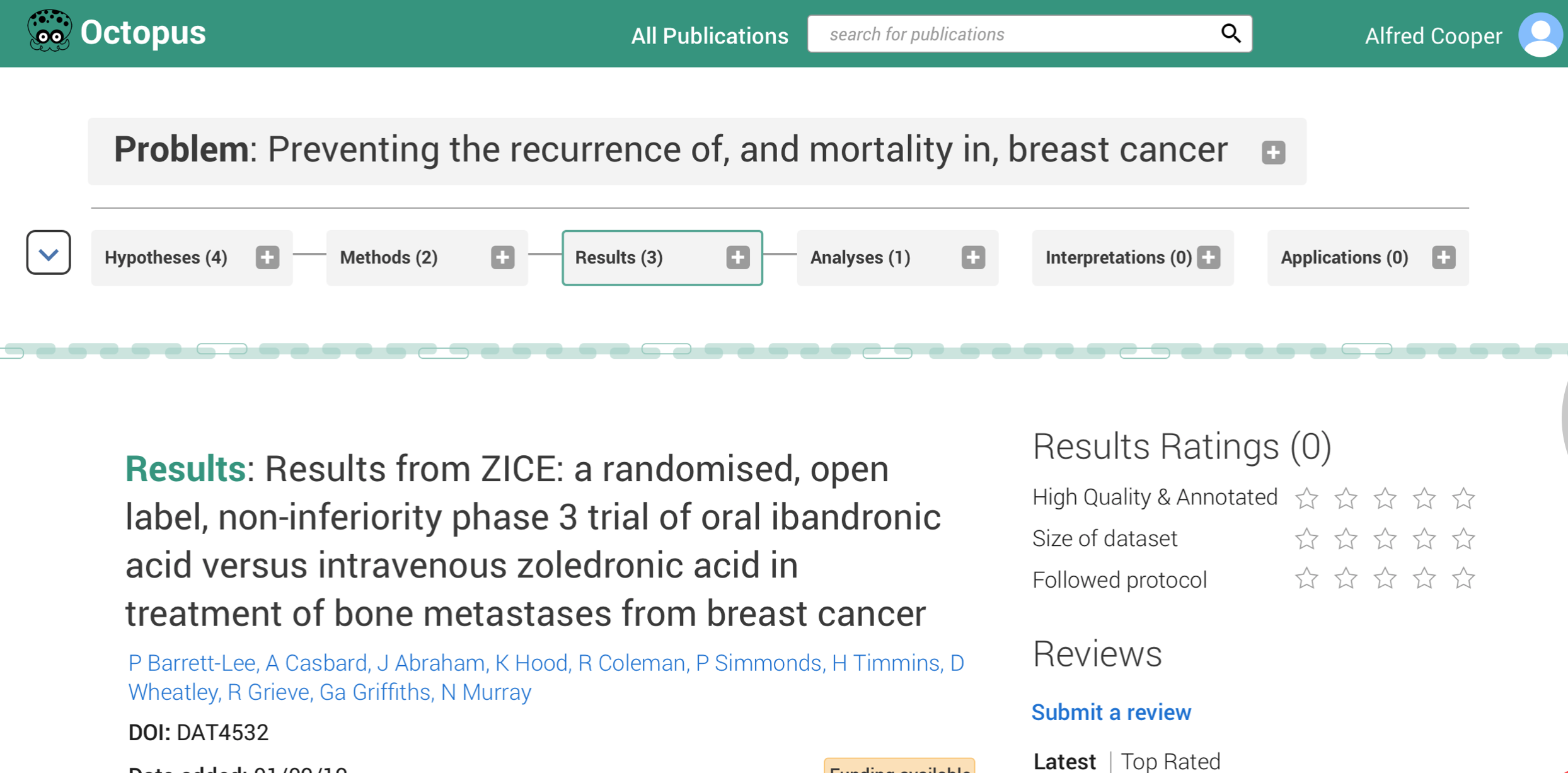
Thanks to the award that Octopus won at the Royal Society, I was able to commission Science Practice to create a series of mock-ups of what Octopus’ user-interface might look like, and how the major features would actually work (as far as the user experience goes). Now those mock-ups are finished and ready for feedback!
Working with the team at Science Practice was incredibly useful. I had met them at the eLife sprint in ay 2018, when this website and the real work on Octopus began, so they were the natural place to go for more help. Having to think through how every feature I had imagined for Octopus would actually function was a very good exercise - as well as deciding what its key features were that I would want to demonstrate through the mock-up.
One of the biggest challenges that we faced was how to illustrate the system of linkage of publications in Octopus. One of its critical features is the fact that publications are not stand-alone, but form chains of linked work, but how would these vertical branching trees of linked publications be illustrated in the user interface, where space is at a premium?
Well, you can judge for yourself, as the mock-ups are now available:
Click here to walk through the templates we have made.
I have added comments to talk through the features and how to navigate the series of templates - you should be able to see these by clicking on the ‘comments’ in the bottom left of each page.
I would love to hear feedback on these. There are lots of small inconsistencies in the text, but I would love to hear about major issues and improvements that you can imagine - or features that you particularly like and think are important to retain. I know that different disciplines of science all have different styles of publication and different needs, so do let me know if you think there is a feature that Octopus needs to include in order to serve the needs of a particular field. Just email me at [email protected]